Fit team
Project Timeline
January 2021-April 2021
Services
Website Design
Website development
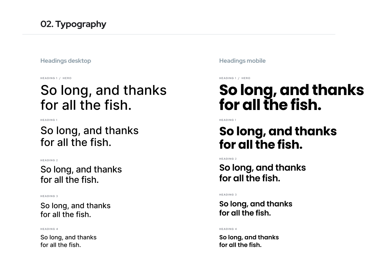
Typefaces
Inter
Manrope
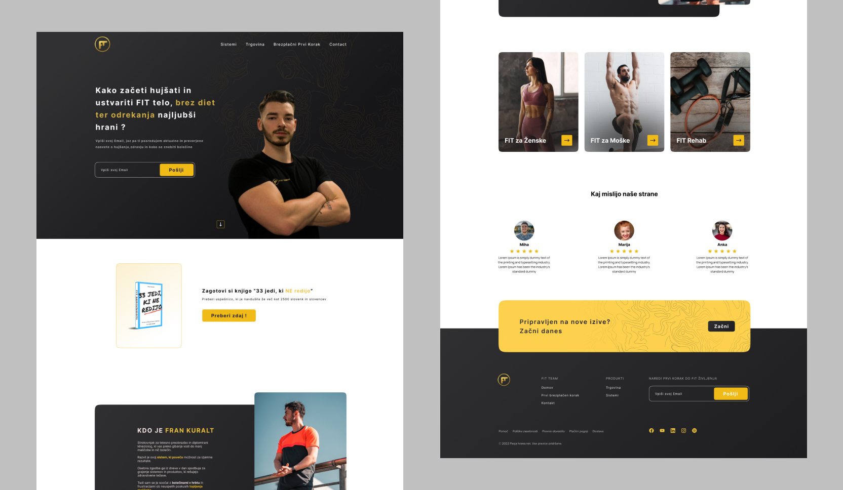
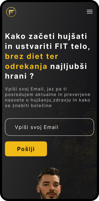
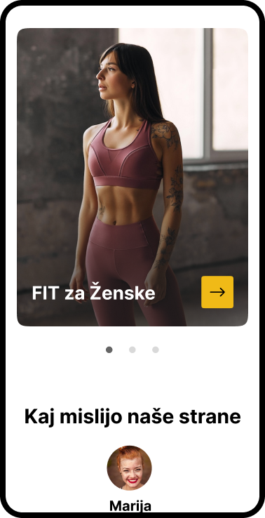
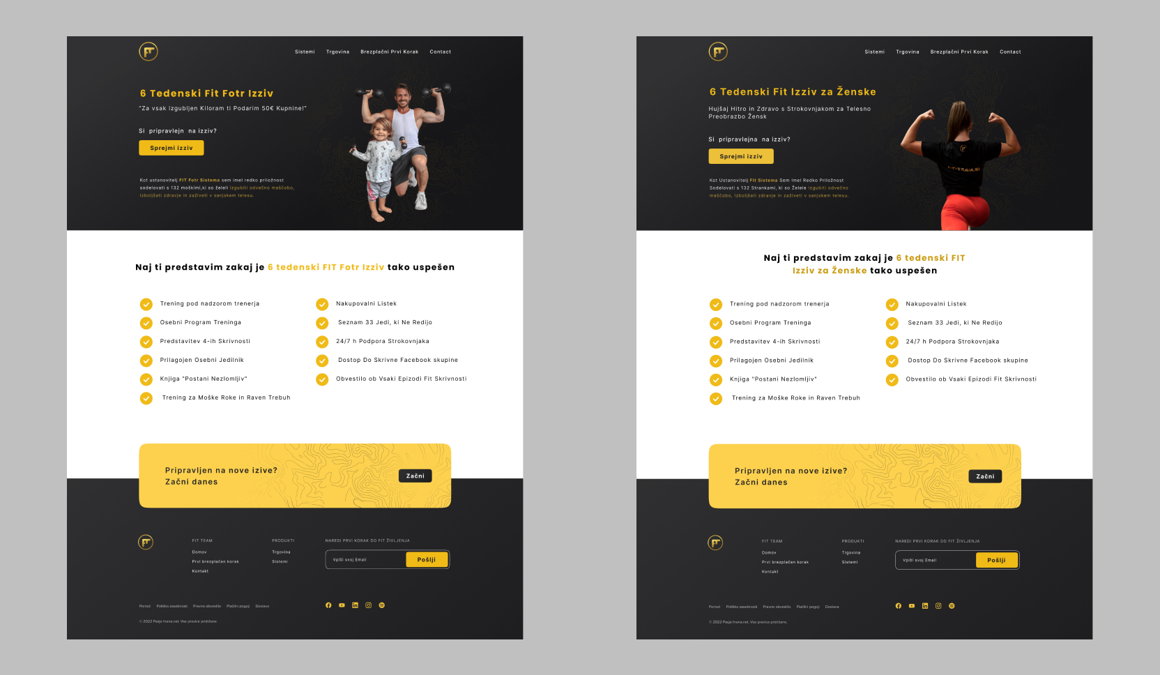
FIT team is a Boutique Fitness Center dedicated to help people with there health and with there rehab proces. After analyzing the organization’s current website, it was decided that a refresh was needed to develop a unique brand identity, emphasize the gravity of the issue, and visually craft a compelling narrative.
Adding white space to the website to give the site a personal touch. The Inter family was chosen as the primary typeface for headlines and The Manrope family for body, adding a layer of sophistication which counterbalances the more hand-done elements of the brand.